This section of the set took the most time and effort to complete, as it required a lot of measuring and working out angles etc. so this blog post is most likely to be quite long! Although I have tried to simplify it a bit just to give the idea of how it was built. 

Items Used
  • A1 White Foam board
  • Miniature lolly pop sticks
  • Ruler
  • 2B pencil
  • Corrugated cardboard 
  • Craft Knife
  • PVA Glue
  • Super glue 
  • Acrylic paints in various colours
  • Various sized paint brushes
  • Cello tape
  • Soft brass brush

To begin with, using some miniature lolly pop sticks as reference to gain an appropriate size for the windows, I drew out the front of the house on an A1 sized piece of foam board. 


Each lolly pop stick was laid out 2mm from each other, doubling that for the door space, and then marked with pencil on the foam board.


The pencil marks were extended to complete the window shapes, as well as the door, with 'X' used to mark the areas required to be removed. 


The exterior line for the front of the house was cut using a craft knife to separate it from the rest of the foam board, leaving the rectangular shape. 


I continued with the craft knife to cut out the window and door sections, being very careful to cut them straight and as accurate as possible. 


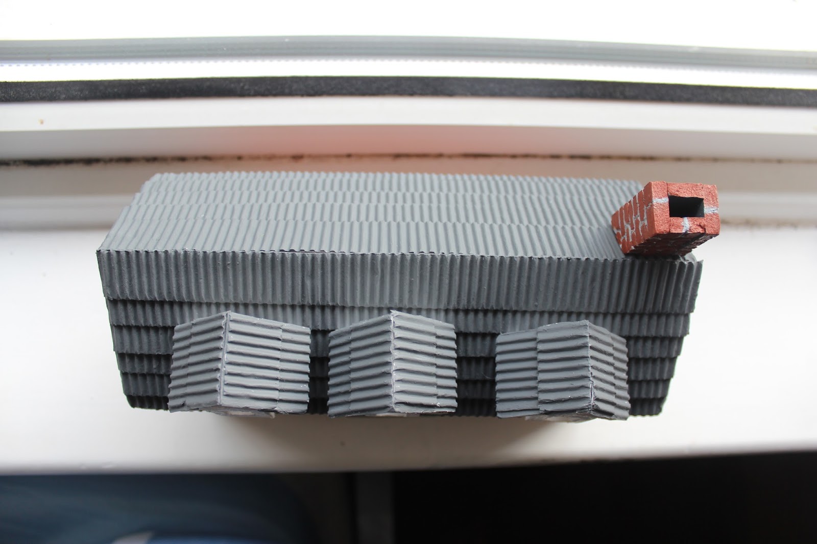
Next I designed three 3D roof top windows to show an upstairs externally to the house. These consisted of a pentagon, with a rectangular window in the centre. These were cut out in the same way as the rest of the house, using a craft knife. 


I laid the cut out sections of the house together in order to get an idea of how the house was looking and whether everything had been sized accurately.


When I was happy with the design I did a test to make sure the pieces fitted together using cello tape to easily assemble or disassemble the pieces as needs be. 


In this test I discovered for the roof to fit securely I had to change the side pieces of the house from rectangles to pentagons. 


To make the roof I tried a bit of trial and error. I cut two rectangular pieces of foam board that were about half an inch longer on both sides, than the front and back pieces of the house. This was so that the roof would sit slightly past the edges of them. The two roof pieces were placed together at the edges  and placed on top of the assembled house, where the angle was adjusted to fit with the pieces below. The two roof pieces were then cello taped in place at this angle just to hold them together and then eventually glued to each other using superglue. 


With the roof in place I was able to assemble the roof top windows at the perfect angle to coincide with the angle of the roof. These pieces were super glued together and then painted white.


I cut some corrugated cardboard into strips at half an inch in width and the same length as the roof pieces.  


These strips were then glued using PVA and overlaid on top of each other on the roof pieces, to give the appearance of tiles.  This was completed on both of the roof pieces. 


I tested some colour on some spare corrugated cardboard I had and finally decided on a dark grey. The entire roof was then painted this colour. Making sure to get in-between the gaps of the cardboard proved to be difficult as I would always come back to find white gaps, and the requirement of another coat of paint. 


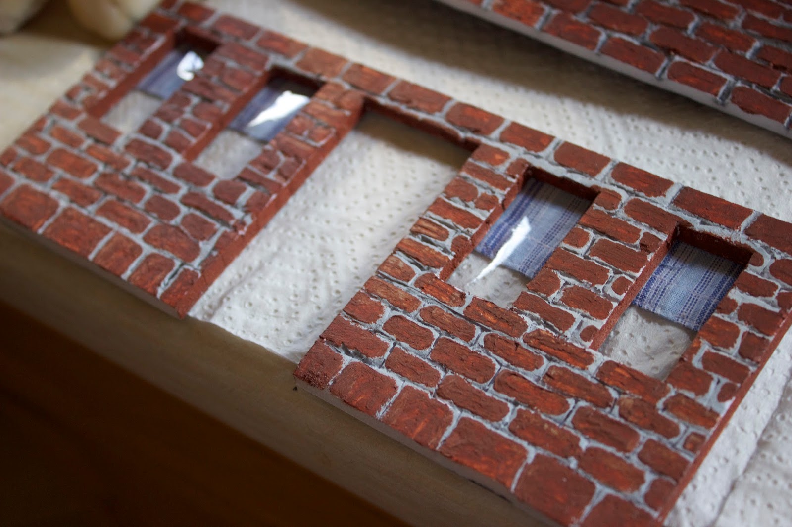
Back on the main pieces of the house, I pealed the plastic coating off the foam board to show the spongy foam underneath. This would allow me to carve easily. I began by drawing the brick onto the board using pencil, to hopefully allow me to be more accurate when carving.


Then using the craft knife, I carved into the lines to give them some depth. This took a long time due to having to be careful and accurate about how you were cutting. The slower you go, the less chance of mistakes. I had to be careful not to cut too deep as well, or else the entire piece would collapse in on itself. This step was created for every piece that required bricks. 


I used a soft brass brush to hit the foam repeatedly with, over the bricks, to give them more of an uneven and less perfect texture to make them more realistic.


Before painting on the actual pieces I made a quick test version to practise colours and see what looked more how I wanted. Initially this test panicked me a bit, as I couldn't really get it to look very good. However it did allow me to see what I needed to do and what I shouldn't be doing. It also inspired me to use a grey colour in the carved out areas as cement to distinguish the bricks from one another. 


I then began to work on the actual pieces. I began by painting the cracks grey, as this was a very messy job due to how thin they were. It was very hard to get a small enough paintbrush to fit, so paint would often go on to the actual bricks themselves. However this was not a problem as the beauty of working with acrylic paints means that paint can easily cover previous paint and rectify any mistakes. I used this to my advantage and individually painted each brick on top of the grey. This was repeated for every piece that had bricks.


Here are all pieces collectively together:


A chimney was made from the foam board as well which was then carved and painted in the same way as all other bricks. 


Cello tape was added to all of the windows in order to give the impression of a reflective surface, and an old shirt was cut up into small rectangles and glued to the inside of the windows as curtains. 


The door measurements were taken, and a foam board rectangular door was cut out. The back of this was made wider so that it could slot into the door's gap in the front of the house without falling out. The door was then painted using acrylics and a door knob was made using an old pin, where the end was painted silver. 


Small rectangles were cut out from the foam board, measuring slightly longer than the windows in width, and painted grey to resemble window sills. Roof pieces were made for the tops of the upstairs roof windows, in a similar but miniature way to the main roof. These were also painted in the same dark grey from earlier.


Finally the house was assembled using a mixture of PVA glue and super glue. 


Items Used

  • A pencil
  • Wooden Board Base
  • Foam (various sizes depending on how high you are making the mountain)
  • PVA Glue
  • Scissors 
  • News Paper
  • Modrock
  • A bowl of water
  • Synthetic grass
On the wooden board base I drew an outline of the shape I wanted the mountain to be. I took into consideration the placement of other things in the set, such as house, as to where the outline would go. After this I put a rectangular shaped area of foam on top of this and sketched the same outline onto this. The shape in the foam was then cut out using scissors and placed on top of the original outline on the wooden base. I repeated this step multiple times, however each time a new piece was cut it was made slightly smaller in width than the previous. This was so that when set on top of the previous piece the mountain would appear to go inwards, resembling mountain rings on a map. It also allowed the mountain to not be just a straight, vertical line, and gave some more definition - mountains are never perfectly smooth.


After I had made sure I was happy with the placement of the foam, I used PVA glue to stick each piece to the previous so it wouldn't fall out of place when moulding the mod rock over the top of it.


This was repeated until all pieces were secured down and the structure was more stable. 


After waiting an adequate time for the PVA to dry, it was time to begin using modrock to further stabilise the structure. In preparation for this newspaper was laid down to catch any mess that would most likely occur. 


Using scissors, I cut small - medium pieces of modrock from the roll, soaked it in water and then applied it along the outside of the foam of the mountain. The modrock requires to me sort of massaged into the exterior, forming a kind of clay like texture. 


I wanted to make sure the modrock went into the different crevasses that were created with the foam so I made an effort to push it inside and hold it in place to mould around these as desired. 


Finally the synthetic grass was applied over the top. I cut one large roll, big enough to cover the entire mountain and then painted on a lot of PVA glue on the back before placing it over the mountain. It was then pressed into the crevasses and held in place for several minutes until dry. I recommend having more hands available for this as well, as it makes life a lot easier!


I decided to research into characterisation and comedic timing for the project, to help us inject what we want into our own characters. This documentary, Chuck Jones - The Evolution of an Artist, provided me with some very helpful information and advice on both and after watching it 3-4 times, I made some notes on some of the most important aspects I took from it. I really believe this will help us make more meaningful characters and environments. 

Chuck Jones puts an emphasis on the amount of time put into character development, mentioning how actors already come with an ability from other parts they've played, however if you bring in a drawing all you have is that drawing. You as the artist have to put in that character. This has put even more of an importance to me about character development - to really inject life into a character you have to give them your time. The least thing I want is to have characters that are less meaningful, less relatable and less full of life, so I will definitely be making sure character development is scheduled in properly and significantly. 

The character development is broken into two questions - what does the character want and as a result, how does the character move? Each character in a story has to have define wants that are easy for the audience to understand. How the individual then moves is dictated by what is going on inside, so to be able to understand the movement of the character you have to think like how they would think - their feelings, their goals, their wants. Jones gave a really helpful quote in saying, "If you can't tell what's happening by the way a character moves you're not animating."

The comedic side of the animation is broken down into assumption and reality - the gag is set up so the audience expects one thing to happen but then another does. This got me thinking about trying to think more outside of the box when it comes to jokes - don't go for the immediately obvious. The advice given from the documentary, and how Jones worked, to stop gags falling into the same routine is to set yourself disciplines and challenges. For example, in the documentary it shows characters that have no face or no mouth or are kept to one line of the same dialogue. The key is to have lots of rules about the world, character and their behaviour. 

I also learnt gags are also set up by human behaviour and logic - if it's not logic it's not going to be funny and if it's not human behaviour then how do people know it's meant to be funny? 

Jones' advice at the end of the documentary was to study a lot of art and to read a lot of books. He put an emphasis on studying the real world and putting it into your work, as how can you draw if you have nothing to draw.  It's not just about drawing a funny face, a lot of research and knowledge has to be done beforehand. 

This documentary helped me a lot with how to develop the characterisation of our story, as before it was an area I was aware needed to be approached but was unsure of where to begin and the right way to do it. Breaking it down into simpler steps has made the process a lot clearer and defined to me and it's definitely given me a starting point for discussion about the characters with my crew. 


Wreck It Ralph (2012)

Wreck it Ralph was one of my immediate thoughts when thinking about the landscape for the project. I like the use of vibrant colours and how various aspects are composed of sweets in relation to the title of the game "Sugar Rush" in the film. This got me thinking more stylistically about how it should look like and how creative we can be when designing the elements. 


It is also a good example of the exaggeration of characteristics in a game-like manner.  


The Incredibles (2004)

Mr. Incredible was also an immediate thought, as suggested by Tom, when thinking about the character for CGI. I particularly like how his strength has been emphasised through the muscles, but when you see him not in costume he also looks more relatable and "dad-like" through his stomach. 


Disney and Pixar (Eyes)

Personally, I really wanted the character to have the very smooth and somewhat cutesy style of eyes, as seen in a lot of Disney/ Pixar work. I want the character's style to not be an exact replica, but rather draw inspiration from and have a certain resemblance in some aspects. I want to maybe exaggerate the already exaggerated eyes that Disney/ Pixar have, as a reference back to the medium. 


Cartoon Network / Johnny Bravo

Growing up watching a lot of Cartoon Network shows has definitely been an influence in wanting to try animation. Johnny Bravo's character is a very good stylistic reference to the body shape we might be going for and his exaggerated movements and poses are also a good reference to what we want to do. 


Ratchet and Clank 

This trailer shows the characters, especially Qwark, interacting with the animator in a humorous way. The animator is shown to be the controller and dictator of what happens in their universe and they make a special reference to not anger the animators as a result! I think this is a similar concept idea to ours and a useful reference to how we should approach the comedy side of our film. 


Stopmotion

Creature Comforts (1989 + 2003)


Creature comforts is obviously a massive inspiration to me for this project, right through from the mockumentary style to the design of the characters and sets.  I remember watching the television series back in 2003, when I was 8 years old with my parents and just finding the whole concept and style really interesting and a  lot of fun. It's something that's stuck with me throughout the years and as I began to see myself wanting to make films it's always been a sort of dream to make a stop motion as a result. 

The original Creature Comforts short (1989), as seen below, shows animals living in a zoo commenting one what it's like to live there. I really love how non-actors were used as the voices, with the film makers taking the answers from the public and contextualising them into the animated zoo animals we see, based from their answers. It's amazing how changing the context a bit, such as turning a family into a bunch of polar bears through animation, can make such a difference. 


Aardman Animations

Aardman Animations is a household name when people think of stop motion animation and like Creature Comforts, Wallace and Gromit was a good part of my childhood television, created by the same people (Nick Park of Aardman Animations). I always loved the distinct style of Aardman, and how their work is automatically distinguishable as their own. 


Some of my favourites (other than Wallace and Gromit and Creature Comforts) are Chicken Run (2000) and Flushed Away (2006).  I'm aware that Flushed Away is not necessarily a stop motion film, and is rather computer animated, however as mentioned before that distinct Aardman style is kept nevertheless.


Tim Burton

Tim Burton has done a fair amount of work in the stop motion area meaning he is also a great inspiration for the project.  One of my favourites is Frankenweenie (2012), adapted from his earlier live action film of the same name (1985), mainly because it's a stop motion about a dog - which is something I'd find very hard not to like! I really love the style, the cinematography, the story and each of the characters very unique and odd personalities. I think the stop motion style works very well with their strange mannerisms and adds even more to that oddball feel that Tim Burton often displays.


Vincent (1992) is another stop motion by Burton which I find very interesting. The short is about a young boy who is deprived of reality from his obsession with Edgar Allan Poe and pretends to be like the actor Vincent Price, who funnily enough is the narrator of the film. I really enjoy seeing an earlier work of stop motion and how it's developed over the years from Vincent to Frankenweenie. 


Here is a small mood board of Tim Burton related various Stop Motions for inspiration : 


Coraline (2009) and ParaNorman (2012)

Both films use stop motion as their animation throughout the film. I the characters and set design has been a helpful bit of inspiration as to where my own project should go with design. I have really enjoyed comparing the stop motion characters and sets throughout each film makers interpretation and maybe I'll be able to find my own style. 

Coraline

ParaNorman


The film begins roughly by one of the characters introducing themselves and their animation style, before going on to the next character in their separate environment. The film will flick back and forth between the characters in their respective environments where they make comments about various aspects of life 'on set' and give us film makers and film lovers / watchers an idea of what it's like behind the scenes from a unique perspective. 


Here are some possible ideas for scenarios that could happen:

Stopmotion
  • Talks about how he feels manipulated all the time (as film maker's hands position him constantly all day)
  • Complaining about having to maintain hard poses for extended periods of time while the film makers take each photo. He poses to demonstrate. A selection of photos could appear as a montage of him pulling various humorous poses on different projects. 
  • Talks about being there after film makers leave the set at the end of the day
  • Is aware of the outside human environment
  • Animation could cut to the film makers actually working on set. 
CGI 
  • Talks about how he only gets to hang out with friends when they are loaded in to the scene
  • When the computer is switched off nothing is there.
  • Talks about fears of being deleted 
  • Can interact with the mouse pointer 
  • World doesn't seem to exist outside of his boundaries - no knowledge of humans? 
  • Character looks out of screen boundaries and theres's just a black void of nothingness. 


Forming the Idea

Vicky's lectures last year got me thinking more about the medium and how to use it different, innovative ways. It crossed my mind, after watching many behind the scenes of various films and TV shows, what it might be like if the characters from the actual shows were interviewed rather than the actors themselves. What would they say in response to the questions? How would they act in our own world? Because after all in their own created worlds could they be argued to be somewhat real beings?  After all what is reality? It might not be what we call reality but don't they have their own reality? So what would it be like to merge our realities into one?